Today, the world is moving at a very fast pace, which has made having an online presence extremely important for your business. Right?
This stands true for you, me, and all the businesses out there. Why?
Because ranking on SERP will help you get a good amount of traffic. To achieve this, you might want to make your website responsive. Trust me, it is not just about the looks. A responsive website will boost your search engine optimization and totally rock your website’s ranking. So let us figure out what a responsive website is and why making your website responsive is so important.
What is a Responsive Website?
In simple terms, it is a website that adapts its layout and content to fit flawlessly on screens of all shapes and sizes.
Picture this: you’re browsing the web on your trusty desktop computer one minute, and the next, you’re flipping through content on your sleek tablet or swiping through your smartphone seamlessly, no hitches. That, my friends, is the beauty of a responsive website, and since this makes the user experience so much better, Google appreciates it too.
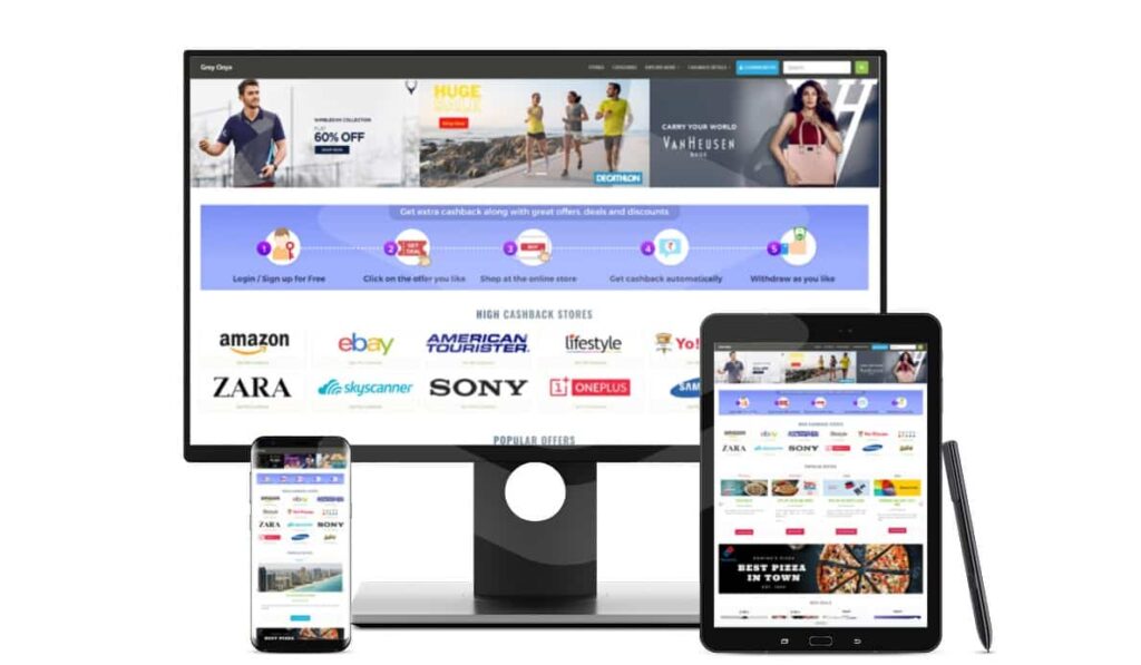
If you already have a responsive coupon website, that’s great! But if you’re looking to create one then ClipMyDeals WordPress Affiliate Coupon Theme is your answer. With just a few clicks, you can transform your website into a user-friendly, responsive platform that not only enhances the user experience but also earns Google’s appreciation.
The Importance of a Responsive Website for your SEO Efforts
Broader Audience
When a user lands on your website, he or she can be either using a laptop, mobile device, or even a tablet. If your website is not responsive, the user will naturally exit your website because of the poor user experience, which will increase the bounce rate for your website. This is a red flag for Google!
In my view, it has become important for your website to accommodate users across diverse devices, considering the rising prevalence of smartphones and tablets for web browsing. By doing so, you can reach potential customers regardless of the device they use, thereby expanding your audience and potential customer base.
Faster Loading Speed
I’m sure we’ve all experienced the frustration of waiting for a web page to load. In fact, many of us tend to avoid websites with slow loading times altogether. That’s why page loading speed is something I consider crucial in SEO. Responsive websites are specifically designed to load quickly and efficiently on all devices. This speed is achieved because the HTML code base remains consistent across all devices, reducing the number of HTTP requests and cutting down on the time it takes for your website to load. A faster-loading website not only improves the user experience but also earns brownie points with search engines like Google.
Easy Share

Responsive design simplifies content sharing on social media and various platforms by ensuring that your content looks great and functions well across all devices. This leads to more content shares, boosting visibility and attracting a higher number of visitors. The end result is a significant improvement in your SEO efforts.
Now, when it comes to optimizing your website, ClipMyDeals Theme is not only responsive, but also social media optimized. It comes with all Meta Tags and Open Graph required for Facebook, Twitter, WhatsApp, Instagram, and all popular Social Media portals. To make the social share visually appealing, the banners and descriptions are used correctly in shared Offers and Store pages (instead of random content or images).
Google Favors It
You probably already know this, but it’s worth emphasizing: Google, the leading search engine, has made it clear that they consider being mobile-friendly when ranking websites. So, here’s the scoop: Google leans towards giving better rankings to websites that are responsive to mobile devices. Now, here’s where it gets interesting for you—by adopting responsive web design, you’re bringing your site in line with what Google prefers.
No Data Duplication
Fun Fact: A responsive website can help you in your SEO efforts by avoiding duplicate content on your website. The trouble arises when you maintain a separate mobile website, essentially creating two versions of your site. Since Google penalizes duplication, it is very difficult for non-responsive websites to rank.
Even when there are solutions available to handle the problem of multiple URLs, such as adding specific tags to link both your mobile and desktop URLs, I must emphasize the importance of getting it right. Improperly added tags can still have a negative impact on your website’s ranking.
However, with a responsive website, you gain a single, adaptable solution that ensures your content isn’t scattered across different URLs. This approach significantly boosts your chances of securing a higher ranking in search results. It’s all about simplifying things and making your SEO efforts more effective.
Higher Conversion Rates
A responsive website brings a fantastic improvement to the overall user experience. You’ll find that users can effortlessly navigate your site, no matter which device they’re using. This enhanced user experience can lead to higher conversion rates. Whether your aim is to sell products, gather leads, or encourage other actions on your site, this is where it really pays off. A positive user experience often goes hand in hand with building higher levels of user trust and engagement, and that can make a significant difference in boosting your conversion rates.
Easy Maintenance
Maintaining and updating responsive websites is a breeze. I’ve discovered that you don’t have to juggle changes at multiple locations, unlike adaptive websites with different structures tailored to various screen sizes. You only need to update once, which significantly cuts down on the chances of discrepancies and errors. It makes content management easy by reducing complexity and ensuring that your website stays adaptable and up-to-date. The result? A more consistent and user-friendly experience across all devices.
Future Ready
A responsive website is important for you because it’s adaptable and future-proof. As new devices with varying screen sizes and resolutions emerge, your responsive website can adjust without requiring you to make significant changes or redesigns. It’s your future-ready solution because it’s adaptable, scalable, cost-effective, and compatible with emerging technologies and user trends. It provides a robust foundation for your website to thrive in an ever-evolving digital landscape, ensuring that your online presence remains effective and competitive in the years to come.
Conclusion
So, let me break down what responsive design means for you: It’s not just about how your website looks; it’s a strategic move that brings significant SEO benefits into play. It empowers you to connect with a broader audience, load your site faster, reduce bounce rates, and climb higher in search engine rankings. It’s all about providing you with a superior user experience that can also increase your conversion rates, contributing to your online success.
By selecting a responsive coupon theme provider such as ClipMyDeals, you’re making a strategic decision that not only guarantees an outstanding user experience but also aligns perfectly with Google’s preferences. This alignment has a direct and positive impact on your website’s visibility and, by extension, your business.